
Color conversion
CMYK profile: Coated FOGRA39 · Formats follow CSS Color 4 naming and WCAG 2.2 contrast rules.
At a glance
| Name | 茜 |
|---|---|
| Romanization | akane |
| Tradition | Japanese traditional colors |
| Attribute | Autumn |
| Family | Orange |
| HEX | #B7282E |
| RGB | rgb(183,40,46) |
| HSL | hsl(357 64% 44%) |
| HSV | hsv(357, 78%, 72%) |
| OKLCH | oklch(0.512 0.179 24.4) |
| LAB | lab(40.87 56.08 32.90) |
| XYZ | 21,12,4 |
| CMYK | cmyk(0.0% 78.1% 74.9% 28.2%) |
| RAL | #B42041 · Raspberry red · RAL 3027 |
About this color
Warmth that invites a smile
茜 is #B7282E, a Orange tone with a clear cultural lineage. Read on its own it belongs to the Orange family; read through its Japanese traditional colors roots, it carries a second layer of meaning.
Design tip
Test 茜 (#B7282E) on a neutral surface first; a Orange accent then looks intentional rather than decorative.
Best use
Give 茜 the single element that must be noticed first, and let the rest of the Orange palette support it.
Psychology
How it is perceived
Psychological effect
茜 raises the perceived energy of a Orange composition and pulls the eye toward action.
Emotional impact
It feels immediate and warm, so it can lift a restrained layout without making it loud.
Symbolism
What it stands for
Cultural significance
In Japanese traditional colors settings the shade carries local references, so verify its symbolism before a campaign.
Positive associations
Positive associations lean toward friendliness, creativity and value, which is why it appears in invitations and seasonal work.
Use with care
Too much surface area can read as cheapness or noise in large doses, so keep it to accents and small fields.
Where it appears
Common design applications
- Campaign landing pages
- Give 茜 the single element that must be noticed first, and let the rest of the Orange palette support it.
- Editorial cover systems
- Give 茜 the single element that must be noticed first, and let the rest of the Orange palette support it.
- Product packaging labels
- Give 茜 the single element that must be noticed first, and let the rest of the Orange palette support it.
- Dashboard status accents
- Give 茜 the single element that must be noticed first, and let the rest of the Orange palette support it.
- Retail wayfinding signs
- Give 茜 the single element that must be noticed first, and let the rest of the Orange palette support it.
Design guidance
How to make it work
Do
- Keep saturated fills below about twenty percent of the layout.
- Use it for the primary call to action and nothing else.
- Check the pairing at small sizes on a neutral background.
Avoid
- Do not place it beside clashing neon greens or electric blues.
- Never use it for long body text on white.
- Avoid gradients that shift its hue into another family.
Brands built on The Everyman, The Jester use it to signal character before they say a word.
Orange sits between heat and sociability, closer to apricot or terracotta than to neon. It feels handmade, generous and slightly informal.
Pairing
Colors that complete it
History
Pigments and provenance
Before synthetic dyes, 茜 was matched with mineral and plant pigments, and the Orange family depended on sources such as ochre, madder and indigo. Screens now reproduce it more consistently than any single pigment ever could.
Tags
Origins & sources
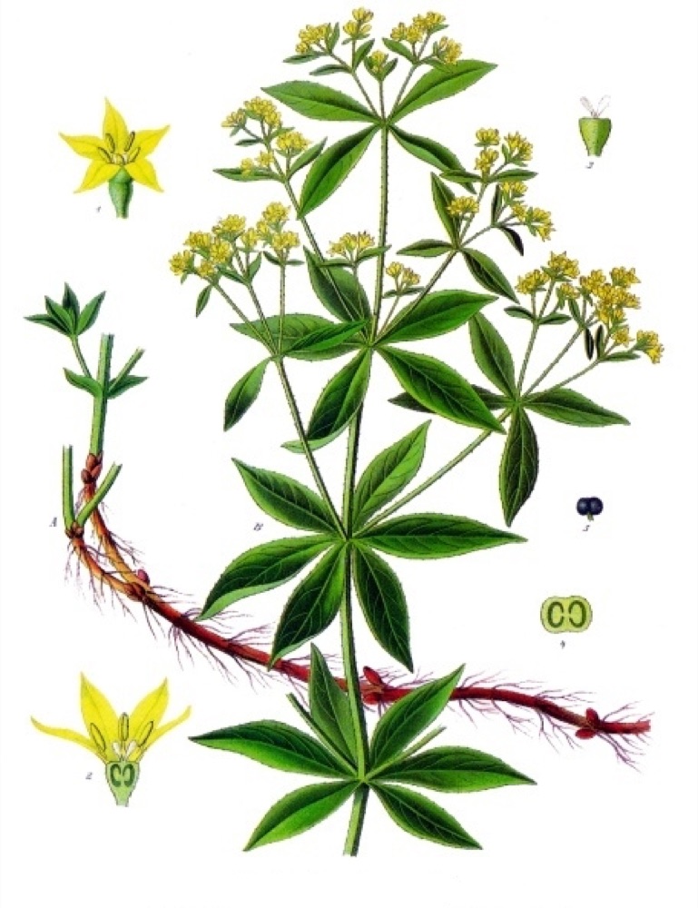
Etymology: “Akane” comes from madder, long used to dye red.
Pigment / material: A red from alizarin in madder roots (Rubia cordifolia and others).
References
Variations
Shades darken and tints lighten while the hue angle stays fixed.
Shades
Darker steps built from the same hue.
Tints
Lighter steps for surfaces and backgrounds.
Design scale 50–950
#DA4B4A · 4.56:1Use cases
- Shades → hover, shadows, depth
- Tints → highlights, surfaces
- Balance → consistent color systems
Design tip
Keep one dominant tone, one supporter and one accent.
Across color systems
The closest named color in each tradition and design system, measured in OKLCH ΔE. Lower means closer.
Asian color traditions
Design systems
Show all (11)
RAL Classic
Where it sits in the library
These figures come from a build-time ranking across all 116 traditional colors on the site, not from hand-written description.
- Lightness L* 40.9 — rank 86 of 116 traditional colors (darker third).
- Chroma C 65.022 — rank 27 (high chroma).
- Hue 357°, in the orange family.
- Closest neighbor in the same hue family: “緋”, ΔE OK 0.064.
Can three steps of one hue work together
Three steps from the 50–950 scale of “茜”: same hue, only lightness differs. Below is the contrast whenever one of them is text on another.
- 200 ↔ 500: 2.31:1 (FAIL)
- 500 ↔ 800: 2.70:1 (FAIL)
- 200 ↔ 800: 6.24:1 (AA)
Pairs reaching 4.5:1 (AA body text): 1 of 3. Pairs reaching 3:1 (large text, icons, borders): 1 of 3. The rest fall below 3:1 and should not carry text.
Color combinations
Rotate the hue wheel while holding lightness steady.
How to use it
Three moves keep the color readable and deliberate.
Why it works
The perceptual reasoning behind the palette.
All six palettes rotate hue at similar lightness, so the best in-group contrast falls between 1.01:1 and 1.66:1. Use them for fills, charts and graphics rather than as text on each other — when you need text, use a neutral or a darker step of the same scale.
Complementary
Opposite the hue wheel; it sharpens the focal color by contrast.
Best use: Calls to action and single-feature highlights
Split-complementary
Two neighbors of the opposite hue; softer than a direct complement.
Best use: Balanced marketing layouts with two accents
Triadic
Three hues spaced evenly; lively but needs one dominant voice.
Best use: Event identities and playful editorial spreads
Analogous
Neighbors on the wheel; quiet, cohesive and easy to scan.
Best use: Backgrounds, charts and calm product pages
Monochromatic
One hue across lightness steps; disciplined and premium.
Best use: Design systems, packaging and typographic hierarchy
Tetradic
Two complementary pairs; rich, but requires strict proportion.
Best use: Complex dashboards and multi-service brands
Export the scale
CSS
:root {
  --brand-50: #FFE9E5;
  --brand-100: #FFD9D2;
  --brand-200: #FFBAB3;
  --brand-300: #FF9A92;
  --brand-400: #FF7973;
  --brand-500: #E25352;
  --brand-600: #C43B3C;
  --brand-700: #A4272B;
  --brand-800: #82151B;
  --brand-900: #600910;
  --brand-950: #420609;
}
Tailwind
theme: {
  extend: {
    colors: {
      brand: {
        50: '#FFE9E5',
        100: '#FFD9D2',
        200: '#FFBAB3',
        300: '#FF9A92',
        400: '#FF7973',
        500: '#E25352',
        600: '#C43B3C',
        700: '#A4272B',
        800: '#82151B',
        900: '#600910',
        950: '#420609',
      },
    },
  },
}
Figma
{
  "brand": {
    "50": {
      "$type": "color",
      "$value": "#FFE9E5"
    },
    "100": {
      "$type": "color",
      "$value": "#FFD9D2"
    },
    "200": {
      "$type": "color",
      "$value": "#FFBAB3"
    },
    "300": {
      "$type": "color",
      "$value": "#FF9A92"
    },
    "400": {
      "$type": "color",
      "$value": "#FF7973"
    },
    "500": {
      "$type": "color",
      "$value": "#E25352"
    },
    "600": {
      "$type": "color",
      "$value": "#C43B3C"
    },
    "700": {
      "$type": "color",
      "$value": "#A4272B"
    },
    "800": {
      "$type": "color",
      "$value": "#82151B"
    },
    "900": {
      "$type": "color",
      "$value": "#600910"
    },
    "950": {
      "$type": "color",
      "$value": "#420609"
    }
  }
}
SVG
<svg xmlns="http://www.w3.org/2000/svg" width="1100" height="120">
  <rect x="0" y="0" width="100" height="90" fill="#FFE9E5"/>
  <rect x="100" y="0" width="100" height="90" fill="#FFD9D2"/>
  <rect x="200" y="0" width="100" height="90" fill="#FFBAB3"/>
  <rect x="300" y="0" width="100" height="90" fill="#FF9A92"/>
  <rect x="400" y="0" width="100" height="90" fill="#FF7973"/>
  <rect x="500" y="0" width="100" height="90" fill="#E25352"/>
  <rect x="600" y="0" width="100" height="90" fill="#C43B3C"/>
  <rect x="700" y="0" width="100" height="90" fill="#A4272B"/>
  <rect x="800" y="0" width="100" height="90" fill="#82151B"/>
  <rect x="900" y="0" width="100" height="90" fill="#600910"/>
  <rect x="1000" y="0" width="100" height="90" fill="#420609"/>
  <text x="50" y="112" font-family="monospace" font-size="10" text-anchor="middle" fill="#444">50</text>
  <text x="150" y="112" font-family="monospace" font-size="10" text-anchor="middle" fill="#444">100</text>
  <text x="250" y="112" font-family="monospace" font-size="10" text-anchor="middle" fill="#444">200</text>
  <text x="350" y="112" font-family="monospace" font-size="10" text-anchor="middle" fill="#444">300</text>
  <text x="450" y="112" font-family="monospace" font-size="10" text-anchor="middle" fill="#444">400</text>
  <text x="550" y="112" font-family="monospace" font-size="10" text-anchor="middle" fill="#444">500</text>
  <text x="650" y="112" font-family="monospace" font-size="10" text-anchor="middle" fill="#444">600</text>
  <text x="750" y="112" font-family="monospace" font-size="10" text-anchor="middle" fill="#444">700</text>
  <text x="850" y="112" font-family="monospace" font-size="10" text-anchor="middle" fill="#444">800</text>
  <text x="950" y="112" font-family="monospace" font-size="10" text-anchor="middle" fill="#444">900</text>
  <text x="1050" y="112" font-family="monospace" font-size="10" text-anchor="middle" fill="#444">950</text>
</svg>
iOS
extension UIColor {
  static let brand50 = UIColor(red: 1.000, green: 0.914, blue: 0.898, alpha: 1.0)
  static let brand100 = UIColor(red: 1.000, green: 0.851, blue: 0.824, alpha: 1.0)
  static let brand200 = UIColor(red: 1.000, green: 0.729, blue: 0.702, alpha: 1.0)
  static let brand300 = UIColor(red: 1.000, green: 0.604, blue: 0.573, alpha: 1.0)
  static let brand400 = UIColor(red: 1.000, green: 0.475, blue: 0.451, alpha: 1.0)
  static let brand500 = UIColor(red: 0.886, green: 0.325, blue: 0.322, alpha: 1.0)
  static let brand600 = UIColor(red: 0.769, green: 0.231, blue: 0.235, alpha: 1.0)
  static let brand700 = UIColor(red: 0.643, green: 0.153, blue: 0.169, alpha: 1.0)
  static let brand800 = UIColor(red: 0.510, green: 0.082, blue: 0.106, alpha: 1.0)
  static let brand900 = UIColor(red: 0.376, green: 0.035, blue: 0.063, alpha: 1.0)
  static let brand950 = UIColor(red: 0.259, green: 0.024, blue: 0.035, alpha: 1.0)
}
Android
<resources>
  <color name="brand_50">#FFE9E5</color>
  <color name="brand_100">#FFD9D2</color>
  <color name="brand_200">#FFBAB3</color>
  <color name="brand_300">#FF9A92</color>
  <color name="brand_400">#FF7973</color>
  <color name="brand_500">#E25352</color>
  <color name="brand_600">#C43B3C</color>
  <color name="brand_700">#A4272B</color>
  <color name="brand_800">#82151B</color>
  <color name="brand_900">#600910</color>
  <color name="brand_950">#420609</color>
</resources>
Principles
Balance
Keep one dominant tone, one supporter and one accent.
Contrast
Test body text against both white and black before shipping.
Harmony
Rotate the hue wheel while holding lightness steady.
Color contrast checker
Test body text against both white and black before shipping.
Give 茜 the single element that must be noticed first, and let the rest of the Orange palette support it.
WCAG contrast standards
WCAG 2.2 sets minimum contrast for text and interface parts. #B7282E measures 6.26:1 against white (AA) and 3.02:1 against black (FAIL). Use the table below to choose the right threshold for the text size.
| Level | Normal text | Large text (18pt+ / 14pt bold) | Icons & UI parts |
|---|---|---|---|
| AAA | 7 : 1 | 4.5 : 1 | — |
| AA | 4.5 : 1 | 3 : 1 | 3 : 1 |
| Fails | < 4.5 : 1 | < 3 : 1 | < 3 : 1 |
Large text means 18pt regular or 14pt bold. UI parts need 3:1 against adjacent colors. AA is the common compliance baseline; AAA is enhanced.
Technical formats
Notation across color spaces
CSS Color 4
sRGB / D65
HSL
perceptual
CIE Lab
CIE LCH
CIE XYZ
CIE LUV
CSS HWB
Practical formats
Ready-to-use values
custom properties
arbitrary value
ARGB
dart:ui
RGB / CMYK
FOGRA39
Color analysis
Measured color properties
relative luminance · warm
vs white · AA · warm
vs black · FAIL · warm
saturation 64% · warm
lightness 44% · warm
緋 #D3381C · warm
Blindness simulator
How it reads with color vision deficiency
How it reads with color vision deficiency · ΔE 19.7
Creative aspects
Culture, mood and story
It is commonly read as energy, warmth, confidence and a trace of ceremony.
It is commonly read as energy, warmth, confidence and a trace of ceremony.
It is commonly read as energy, warmth, confidence and a trace of ceremony.
It is commonly read as energy, warmth, confidence and a trace of ceremony.
It is commonly read as energy, warmth, confidence and a trace of ceremony.